Amazon Beauty Listings That Sell: Design Tips and Examples for Beauty Products 2025
Tips That Actually WorK
The beauty industry on Amazon is booming—but so is the competition. With thousands of new skincare, haircare, and cosmetic products launching every month, standing out from the crowd is no longer just a matter of great ingredients or effective formulas. Your product’s visual presentation can make or break your listing.
Design plays a powerful role in how customers perceive beauty products. It’s the first impression, the silent salesperson, and the credibility booster all in one. In this guide, we’ll explore everything you need to know about Amazon Beauty Listings Design to help your brand thrive in 2025. From design fundamentals to emerging trends and real-life examples, you’ll walk away with inspiration and actionable strategies to elevate your listings—and your sales.
- Why Design Matters in Amazon Beauty Listings
- Key Elements of High-Converting Amazon Beauty Listings Design
- Top Trends in Amazon Beauty Listings Design for 2025
- Key Tips For Optimizing Design for Mobile Amazon Shoppers
- Mistakes to Avoid in Amazon Beauty Listings Design
- Is Hiring Design Experts Is Worth It – Design Agencies VS DIY
- How to Brief Your Designer for Maximum Results
- Bonus Tips for New Beauty Sellers on Amazon
- Your Visual Advantage: Building a Beauty Brand That Converts
- FAQ: Amazon Beauty Listings Design
Why Design Matters in Amazon Beauty Listings
Let’s be clear—design isn’t just about making your listing look nice. In the beauty category, it’s a critical driver of success. Why? Because beauty products are deeply emotional purchases. Customers want to feel confident, attractive, and rejuvenated—and they often rely on visuals to tell them whether a product can deliver on those promises.
On Amazon, customers can’t test, touch, or smell your product. So they rely on the next best thing: your images. A well-designed listing builds credibility, evokes emotion, and answers key questions visually. Is this product clean and premium? Does it fit my routine? Will it match my skin tone? These answers must be felt instantly, without the shopper reading a single word.
Moreover, visual presentation directly impacts conversion rates. Studies have shown that customers make snap judgments about product quality based on how it looks online. In a category where packaging, color palettes, and lifestyle imagery matter deeply, strategic Amazon Beauty Listings Design can set your brand apart—and dramatically improve performance.
Key Elements of High-Converting Amazon Beauty Listings Design
Now that we’ve established the power of great design, let’s break down the most important components of a high-performing beauty listing. Every element on your product page should serve a purpose—and when executed well, each one builds trust and boosts your likelihood of a sale.
Main Image: Your First Hook

Your main image is your primary weapon in the battle for attention. As customers scroll through dozens of options, this image is your first—and often only—chance to win the click. It needs to be clean, compelling, and compliant with Amazon’s image guidelines.
Here’s what sets a strong main image apart:
- High resolution and proper lighting: Your product should look crisp and polished, without shadows or glare.
- White background: This is a strict requirement from Amazon, and it ensures your listing looks professional and consistent with others on the platform.
- Centered, unobstructed product view: Show the entire item clearly, ideally with the label facing forward.
- Minimal distractions: No props, watermarks, or extra text unless you’re using Premium A+ features.
In beauty, this image is often the customer’s first impression of your brand—so treat it like a product photoshoot. A stunning serum bottle with gold accents or a close-up of a lipstick with its cap removed can convey luxury and detail even in a single frame.
Infographics: Educate Without Losing Interest

Once your main image has caught a shopper’s attention, it’s time to inform them—and that’s where infographics shine. Especially in the beauty category, shoppers want to understand not just what your product is, but why it matters. What makes your moisturizer different and skin types is it best for? What results can customers expect?
Infographics allow you to communicate this key information quickly and visually, without overwhelming the viewer.
Here’s how to make your infographics work hard for you:
- Focus on benefits, not features. Don’t just list ingredients—explain what they do. For example: “Hyaluronic Acid – Deep Hydration” or “Vitamin C – Brightens and Evens Skin Tone.”
- Use icons and bold headings. Visual cues like water droplets for hydration or sun rays for brightening help communicate at a glance.
- Keep it concise. Shoppers skim. Limit yourself to 3–5 key points per image.
- Maintain brand consistency. Match the typography, color palette, and visual tone to your product’s packaging and overall brand identity.
Infographics should feel like a mini visual brochure. When done well, they not only inform but also reinforce your product’s value and leave a lasting impression.
Lifestyle Images: Sell the Outcome, Not Just the Product
Beauty isn’t about buying a bottle or a jar—it’s about achieving a result. Whether it’s glowing skin, fuller lashes, or a rejuvenated look, customers want to see what your product can do for them. Lifestyle images allow you to go beyond the product itself and show it in action—used by real people, in real contexts.
This is especially powerful in the beauty space because it creates an emotional connection. Customers can picture themselves using your product in their daily routine or becoming the person they aspire to be.
To craft compelling lifestyle images:
- Show diversity. Reflect a range of skin tones, hair types, ages, and gender expressions. Today’s shoppers expect inclusivity—and they connect more deeply with brands that represent them.
- Capture real moments. Morning skincare rituals, makeup applications, unboxing experiences—all of these create relatable, aspirational scenarios.
- Emphasize the result. Whether it’s radiant skin or a flawless finish, the end result should be the visual focus—not just the act of applying the product.
Lifestyle images humanize your brand. They bridge the gap between product and purpose, helping shoppers see not just what you sell—but what it can do for them.
Brand Story and A+ Content
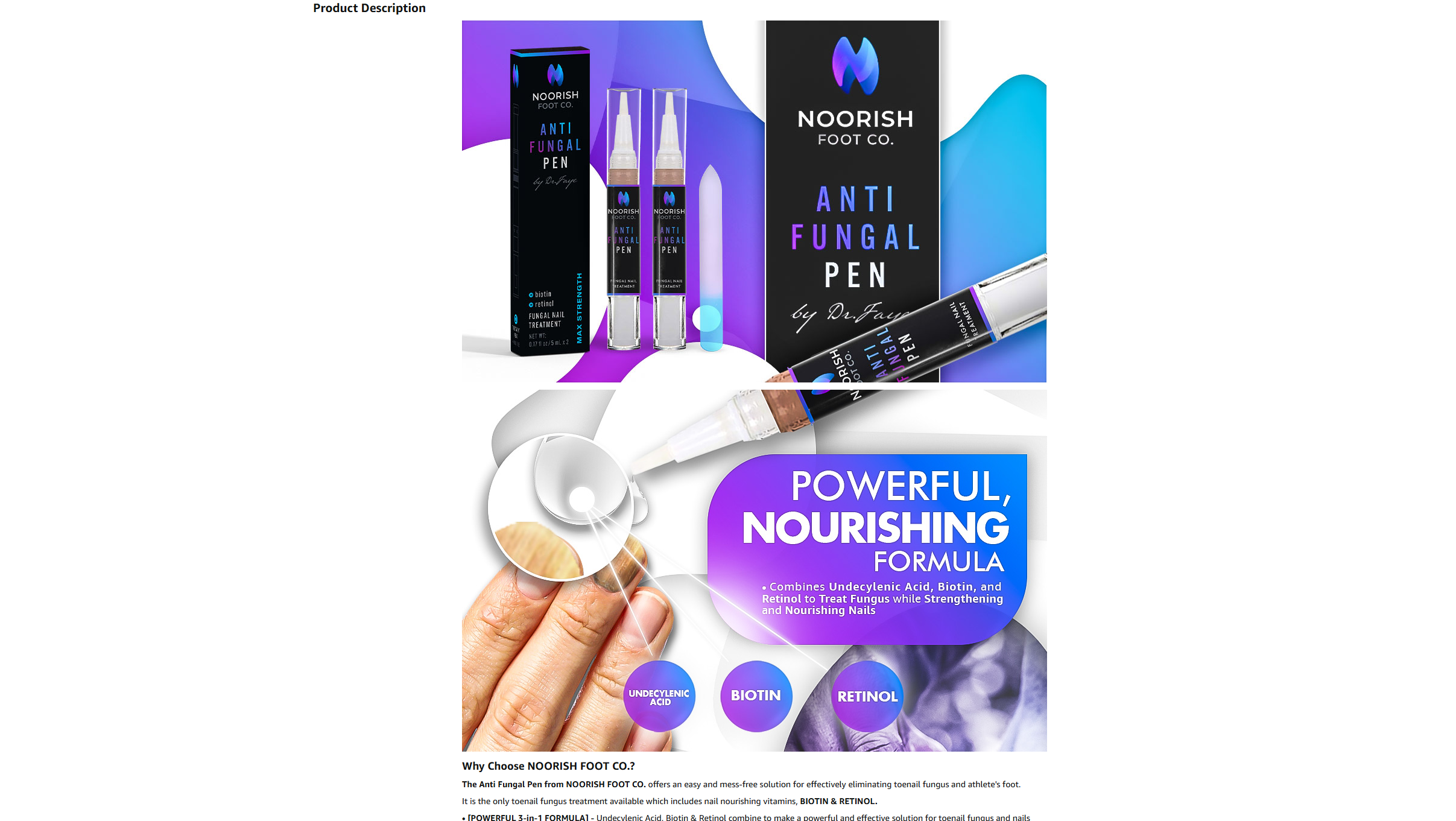
Once a potential customer is intrigued by your visuals and understands the benefits, it’s time to build trust—and that’s where your brand story and A+ Content come in. Especially in the beauty category, shoppers are drawn to brands with purpose, personality, and values that align with their own.
A+ Content (available to brand-registered sellers) allows you to add rich, customized modules to your product page. This includes banners, comparison charts, text overlays, and additional images that let your brand voice shine through.
How to use A+ Content to tell your brand story effectively:
- Introduce your mission. Are you cruelty-free? Female-founded? Focused on sustainability? Say it proudly.
- Show your journey. A short founder story or “why we started” timeline creates a personal connection.
- Highlight your brand pillars. Use visuals and headlines to reinforce key themes—clean ingredients, dermatologist backing, eco-conscious packaging, etc.
- Offer comparison charts. Help customers understand how your product fits into their routine, and how it stacks up against your other SKUs.
By combining compelling imagery with thoughtful storytelling, A+ Content can deepen the emotional impact of your listing. It’s more than just a feature—it’s a tool for brand building, customer education, and long-term loyalty.
Packaging and Unboxing
In the beauty world, packaging is part of the product. Shoppers often equate packaging quality with product quality—and a beautifully packaged item feels more premium, giftable, and worth the price. If your product looks amazing on the shelf or in the customer’s hand, don’t hide it—highlight it in your listing.
Unboxing imagery can be particularly effective in creating excitement and elevating perceived value. These visuals also tap into the “treat yourself” mentality that drives many beauty purchases.
When showcasing packaging, consider the following:
- Show both box and bottle/tube/jar. Give a complete picture of what the customer will receive.
- Highlight texture and details. Embossed logos, metallic finishes, frosted glass—zoom in and show them off.
- Use flat-lay or unboxing shots. A beautifully styled flat-lay with tissue paper, ribbon, or skincare accessories can create a luxurious, editorial feel.
- Promote sustainability if relevant. If your packaging is eco-friendly or refillable, use icons or short callouts to explain that value.
Ultimately, your packaging is an extension of your brand. When you make it part of the listing experience, you increase perceived value and turn a simple product into an aspirational purchase.
Top Trends in Amazon Beauty Listings Design for 2025

Design trends are constantly evolving—especially in the beauty space, where aesthetics drive both attention and aspiration. What felt fresh and modern two years ago may now seem outdated or generic. To stay competitive on Amazon in 2025, beauty brands must be visually in tune with what today’s consumers expect.
Fortunately, we’re seeing a shift toward authenticity, simplicity, and emotional connection—values that align well with beauty’s transformation from vanity to wellness.
Minimalist Elegance
Simplicity is powerful. Gone are the days of overly cluttered layouts and excessive decoration. Today’s shoppers crave visual calm—especially in the wellness and beauty space.
Expect to see:
- Clean lines and generous white space
- Neutral and pastel tones like beige, soft lilac, sage green, and blush pink
- Subtle gradients to add depth without distraction
- Soft shadows, feathered textures, and delicate fonts
This design approach signals quality, calm, and confidence. It tells the customer, “We don’t need to shout—our product speaks for itself.”
Earth Tones and Eco-Friendly Visuals
As sustainability becomes more than a buzzword, beauty brands are shifting toward more natural, earthy aesthetics to reflect their values. Design now goes hand in hand with ingredient integrity and environmental responsibility.
Expect to see:
- Shades inspired by nature: clay, sand, moss, rosewood
- Leafy overlays or botanical illustrations
- Packaging made to look recyclable or reusable, even in digital form
- Callouts for certifications like “Vegan,” “Cruelty-Free,” or “Plastic-Free”
These visuals instantly connect with conscious consumers who want to support brands that align with their values.
Science-Backed Skincare Aesthetics

As beauty increasingly overlaps with wellness and dermatology, many brands are leaning into a “clinical” or “science-forward” design style. It’s a smart way to signal credibility and efficacy, especially in skincare and anti-aging products.
Expect to see:
- Molecule icons and chemical structure overlays
- Dropper visuals with exact percentages (e.g., “2% Salicylic Acid”)
- Lab imagery with soft-focus lighting
- White and icy blue color schemes for a clean, clinical feel
This trend builds trust and helps communicate that your product works, even before the customer reads the claims.
Inclusive Representation
Modern beauty brands must represent the real world. Diversity is no longer optional—it’s expected. That means showcasing different skin tones, genders, body types, and ages across your lifestyle visuals.
Expect to see:
- Multicultural models of varying ages and complexions
- Gender-neutral design in both packaging and photography
- Close-up shots showing natural skin texture (freckles, fine lines, pores)
- Real user-generated content incorporated into listings
Representation isn’t just the right thing to do—it’s smart business. It helps more customers see themselves in your brand and builds loyalty through authenticity.
“Nature Meets Tech” Design Fusion
One of the most exciting trends in 2025 is the fusion of botanical beauty with futuristic design. Brands are blending soft nature-inspired visuals with sharp, modern elements—creating a look that’s both grounded and advanced.
Expect to see:
- Petals and plant leaves overlaid with digital graphics
- Futuristic fonts paired with earthy textures
- Light effects, overlays, and motion-inspired graphics (especially in video)
- Juxtaposition of soft organics and sleek minimalism
This hybrid aesthetic is particularly effective for positioning your brand as both holistic and high-tech—ideal for today’s beauty consumer who wants natural ingredients backed by real results.
Key Tips For Optimizing Design for Mobile Amazon Shoppers

In 2025, mobile dominates the Amazon marketplace—especially in the beauty category. According to recent reports, over 70% of Amazon shoppers browse and purchase directly from their smartphones. That means your beautiful, well-designed listing must look just as compelling on a 6-inch screen as it does on a desktop.
Too often, sellers create visually rich listings that fall flat on mobile because the fonts are too small, the layout is cluttered, or the images don’t translate well at a smaller scale. That’s a missed opportunity. If you want to compete, you need to take a mobile-first approach to your Amazon Beauty Listings Design.
Use Large, Readable Fonts
Small, elegant typefaces may look sleek on desktop, but on mobile they’re practically unreadable. When designing infographics or A+ Content, choose fonts that are bold and legible at small sizes. Stick to clear sans-serif typefaces and test on an actual phone screen before publishing.
Also, limit text-heavy graphics. Mobile users skim, not read. Use bullet points and headlines to keep information digestible.
Prioritize Image Hierarchy
Not all images are viewed equally. On mobile, only the first 2–3 images are guaranteed to be seen before a shopper needs to scroll or swipe. That means your most important visuals should appear first in your image stack.
Order your images strategically:
- Main image
- Lifestyle image showing the result
- Infographic with benefits or hero ingredient
- Packaging and unboxing experience
- Brand mission or A+ highlights
Make sure each image has a specific job—and keep the first three laser-focused on conversion.
Optimize for Vertical Viewing
Smartphone screens are vertical. Your visuals should be too. Horizontal or square graphics often require pinching and zooming, which adds friction. Instead, design with vertical stacking in mind—especially for infographics and A+ layouts.
Use column-based structures that guide the eye from top to bottom, with plenty of spacing and clear section breaks. Think of it like designing a social media post, not a desktop webpage.
Simplify for Scroll Speed
Mobile shoppers scroll fast. Your listing has just a few seconds to make an impression. That means every design choice must support speed, clarity, and instant comprehension.
Avoid:
- Cluttered visuals
- Paragraph-length text blocks
- Overuse of small icons or decorative elements
Instead, lean into white space, contrast, and concise visual messaging. Use bold visuals that grab attention immediately—especially in the first few frames.
Test Across Multiple Devices
Finally, don’t assume your listing looks perfect just because it passed your desktop check. Always preview your images and A+ Content on multiple devices: iPhone, Android, tablet, and even older smartphones if possible.
Better yet, gather real feedback. Ask friends or early customers to view your listing on mobile and tell you what stands out (or what doesn’t). A few small tweaks based on usability insights can significantly boost your mobile conversion rate.
Designing for mobile is no longer optional—it’s foundational. When your Amazon Beauty Listings Design is optimized for the small screen, you meet your customers where they are and make their path to purchase feel seamless, intuitive, and visually delightful.
Mistakes to Avoid in Amazon Beauty Listings Design

While strong visuals can set your product apart, poor design choices can have the opposite effect—undermining your credibility, confusing shoppers, or even violating Amazon’s policies. Avoiding these common mistakes is just as important as following best practices.
Whether you’re a first-time seller or scaling a beauty brand, steering clear of these pitfalls will protect your brand reputation and keep your listings converting.
Overloading Graphics with Text
One of the most frequent mistakes sellers make is trying to say too much in a single image. While it’s tempting to cram every feature and benefit into your infographics, this often backfires—especially on mobile. Shoppers get overwhelmed, skip the image, or worse, abandon the listing altogether.
Instead:
Use visual hierarchy to your advantage. Keep one key message per image and let icons, color, and layout do the heavy lifting. Think bite-sized information, not a novel.
Inconsistent Branding
Beauty buyers are highly brand-conscious. If your listing lacks consistency—from color palette and typography to image tone and messaging—it sends a signal that your brand isn’t cohesive or trustworthy. Even if your product is excellent, poor branding can make it feel amateurish.
Instead:
Stick to a defined visual identity. Use the same fonts, colors, and tone across all your graphics. If your packaging is clean and natural, your visuals should reflect that vibe—not something loud or chaotic. Consistency builds trust.
Low-Quality or Blurry Images
This should go without saying, but low-resolution, pixelated, or poorly lit images are an instant turn-off. In the beauty category, where presentation is everything, poor image quality suggests low product quality.
Instead:
Invest in professional photography or high-end renders. Use natural lighting, neutral backgrounds, and crisp focus. If you’re showing texture (like cream or powder), zoom in to make it vivid and tactile. Every detail matters.
Violating Amazon’s Guidelines

Amazon has strict image requirements—and failing to meet them can lead to suppressed listings or worse. Beauty sellers often get flagged for using text in main images, adding decorative elements, or including lifestyle props that aren’t allowed.
Instead:
Familiarize yourself with Amazon’s image policies:
- Main image must have a white background
- No props, watermarks, or text in the main image
- Product must fill at least 85% of the image frame
- No offensive or misleading content
When in doubt, keep it clean, simple, and compliant.
Unrealistic Claims or Overpromising
Shoppers are savvy, and nothing breaks trust faster than exaggeration. Before/after images with miraculous results or bold promises like “Erase all wrinkles in 24 hours” are not only misleading but may also violate Amazon’s advertising rules.
Instead:
Focus on credibility. Use clear, honest claims backed by your ingredients or testing. Show results over time, use customer testimonials where allowed, and let your visuals convey quality without hype.
Is Hiring Design Experts Is Worth It – Design Agencies VS DIY

In the fast-paced and competitive world of Amazon beauty, presentation is everything. While it may be tempting to handle your listing visuals yourself, especially when starting out, the truth is that professional design can be a game-changer. A strong Amazon Beauty Listings Design strategy is not just about making things look pretty—it’s about making them convert.
Design experts bring more than technical skills—they bring strategic thinking. They understand visual storytelling, consumer psychology, and Amazon-specific best practices. With their help, your listing doesn’t just stand out—it performs. From crafting a scroll-stopping main image to developing benefit-driven infographics, expert designers know how to turn casual browsers into loyal buyers.
Professional design also ensures brand consistency across all touchpoints—your Amazon storefront, your packaging, your social media, and beyond. This cohesion builds trust and reinforces your brand identity in a crowded marketplace.
Moreover, hiring a seasoned designer saves you time and costly trial-and-error. Instead of wrestling with Canva or trying to interpret Amazon’s design guidelines, you can focus on building your business while a specialist handles the visual heavy lifting.
Most importantly, expert design drives real results. Sellers who invest in high-quality visuals often see significant improvements in click-through rates, conversion rates, and overall revenue. When your listing looks premium, customers are more willing to pay premium prices—and more likely to come back.
In short, professional design isn’t just worth it—it’s a critical investment in the long-term success of your beauty brand.
How to Brief Your Designer for Maximum Results
Hiring a professional designer is a smart move—but to get the most out of that investment, you need to provide a clear, strategic brief. A well-prepared brief ensures that your designer understands your goals, brand, and product inside and out, allowing them to deliver visuals that hit the mark on the first try.
Great design starts with great communication. Here’s how to build a designer brief that leads to powerful, conversion-boosting visuals for your Amazon Beauty Listings Design.
Define Your Target Customer

The first thing your designer needs to know is who you’re speaking to. Are you targeting Gen Z skincare enthusiasts or luxury-focused women in their 40s? Is your product for people with sensitive skin, acne-prone skin, or mature skin? Share details like age range, skincare concerns or beauty goals, and lifestyle preferences. Knowing the audience helps your designer choose the right tone, colors, imagery, and layout.
Clarify Your Brand Identity
If your brand already has a style guide, include it in the brief. If not, provide examples of your brand colors, logo, preferred fonts, and the tone you want to project—clinical, luxurious, playful, or earthy. This ensures consistency across your Amazon listing, packaging, and other touchpoints.
Outline Your Product’s Unique Selling Points
What sets your beauty product apart? Is it a vegan formulation? Dermatologist-developed? Packaged in sustainable glass jars? Make sure your designer understands your value proposition so they can highlight it visually. Clearly list three to five core benefits, star ingredients, any certifications like “cruelty-free” or “USDA Organic,” and keywords or claims you want emphasized.
Share Visual Inspiration

Design is visual—so show, don’t just tell. Provide your designer with competitor listings you admire (and why you like them), a Pinterest board or folder of on-brand visual examples, and high-resolution photos of your product and packaging. This will help ensure alignment on the desired look and feel.
Provide Clear Deliverables and Platform Specs
Your designer needs to know exactly what you’re asking for—whether it’s seven Amazon listing images, a set of infographics, a full A+ Content layout, or a hero image for your Amazon Storefront. Also, provide Amazon’s latest image guidelines to ensure compliance with resolution, white background requirements, and layout restrictions.
Leave Room for Expertise
While your vision is important, remember that you hired a designer for their skill and insight. Be open to feedback and creative suggestions—they may offer fresh perspectives or strategies that elevate your listing beyond what you originally imagined.
A thoughtful, well-structured brief sets the stage for a successful collaboration. When both sides are aligned, the end result is faster, stronger, and more effective visual content that helps your listing stand out and convert.
Bonus Tips for New Beauty Sellers on Amazon
Launching a beauty brand on Amazon can feel overwhelming, especially when you’re competing against well-established names with big budgets. But with the right mindset and attention to detail, new sellers can absolutely break through. Alongside great visuals, there are several strategic steps you can take to build a strong foundation and accelerate your growth.
Pair Visuals with Keyword-Optimized Copy

Design catches the eye, but copy drives visibility. Use keyword research tools like Helium 10 or Jungle Scout to uncover high-volume, relevant terms for your product. Then, incorporate those keywords naturally into your title, bullet points, and backend fields.
Just as importantly, make sure your visuals and copy work together. If your image highlights “Hyaluronic Acid for Deep Hydration,” make sure that same benefit is reinforced in your bullet points.
Gather Reviews Early
Social proof is critical in the beauty space. Before shoppers trust a new brand, they want to see real results from real people. While Amazon’s review guidelines are strict, there are still ethical ways to build your reviews quickly.
Use product inserts to encourage feedback, follow up with post-purchase emails through Amazon’s Request a Review button, and consider launching through Amazon Vine if eligible. The faster you collect honest, positive reviews, the faster your conversion rate climbs.
Leverage Customer Feedback to Iterate
Your listing shouldn’t be static. Use customer questions, reviews, and competitor insights to improve your visuals and messaging over time. If buyers seem confused about how to use your product, add a usage infographic. If they’re praising a particular ingredient, highlight it more prominently.
Being responsive to feedback shows customers you’re listening—and that you’re committed to improving their experience.
A/B Test Your Visuals
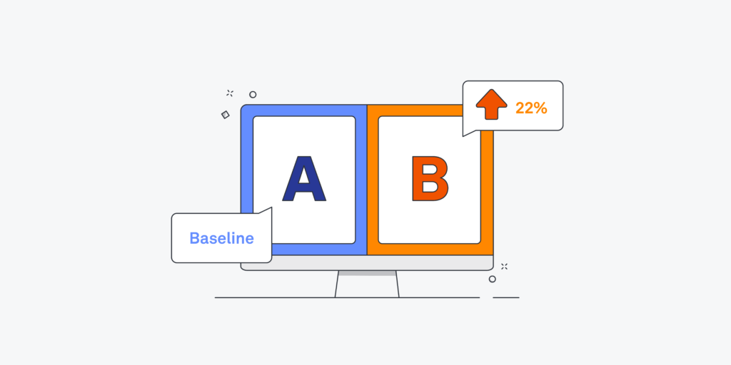
Amazon’s “Manage Your Experiments” feature allows you to test two versions of your main image, title, or A+ Content and see which performs better. This is a powerful way to optimize your listing based on real shopper behavior, not just guesswork.
Test different angles, packaging displays, or color schemes. Sometimes a small change—like zooming in on texture or including a lifestyle image first—can significantly boost your click-through or conversion rates.
Build a Brand, Not Just a Product
Don’t think of your listing as a one-time launch. Think of it as the start of a brand journey. Invest in high-quality packaging, a memorable unboxing experience, and consistent visual language across platforms.
Consider expanding your product line strategically—whether through bundles, complementary SKUs, or seasonal launches. And wherever possible, engage with customers post-purchase to turn one-time buyers into loyal fans.
Your Visual Advantage: Building a Beauty Brand That Converts
In today’s crowded Amazon marketplace, design is more than just decoration—it’s your secret weapon. Every element of your Amazon Beauty Listings Design, from your main image to your A+ Content, works together to shape perception, build trust, and drive conversions.
Beauty shoppers are visual, emotional, and increasingly discerning. They want to see themselves in your brand. They want clarity, credibility, and confidence in their purchase—all of which your visuals must deliver in seconds. That’s why investing in high-quality, strategic design is not a luxury—it’s a necessity.
Whether you’re launching your first product or scaling a growing line, the time and resources you invest into your listing visuals will pay off in stronger customer relationships, better reviews, and a brand that stands out on every page.
Start with a clear vision. Hire experts when it counts. Stay true to your identity. And let every image, every detail, and every scroll tell the story of a brand that’s worth buying from—again and again.
FAQ: Amazon Beauty Listings Design
What design tools or platforms are best for Amazon listings?
Professional designers typically use Adobe Photoshop, Illustrator, Figma, and advanced 3D rendering software. Canva works for basic needs, but is generally too limited for premium, Amazon-compliant design work.
Can I use the same images on Amazon and my Shopify store?
Yes—but keep in mind that Amazon has stricter content guidelines, especially for main images. What works on Shopify or Instagram may need to be modified to meet Amazon’s standards.
How often should I update my listing images?
At least once a year, or whenever you rebrand, improve packaging, release new variations, or notice a decline in performance. Regular updates keep your listing fresh and responsive to market trends.
How do I find a good Amazon beauty design expert?
Look for designers or agencies with proven experience in Amazon listings—especially in the beauty space. Review their portfolio, ask about past results, and ensure they understand both branding and Amazon compliance.
Is A+ Content worth it for new sellers?
Absolutely. A+ Content builds brand credibility, reduces return rates, and boosts conversions. Even for new brands, it’s an essential part of a polished, competitive listing.
Have an Amazon product in mind?
We handle your entire Amazon listing from start to finish — including your title, listing images, A+ Content, and even your Brand Storefront.


